eiCompare: Visualizations
This vignette aims to highlight the functionalities within eiCompare to produce plots. These visualizations include:
-
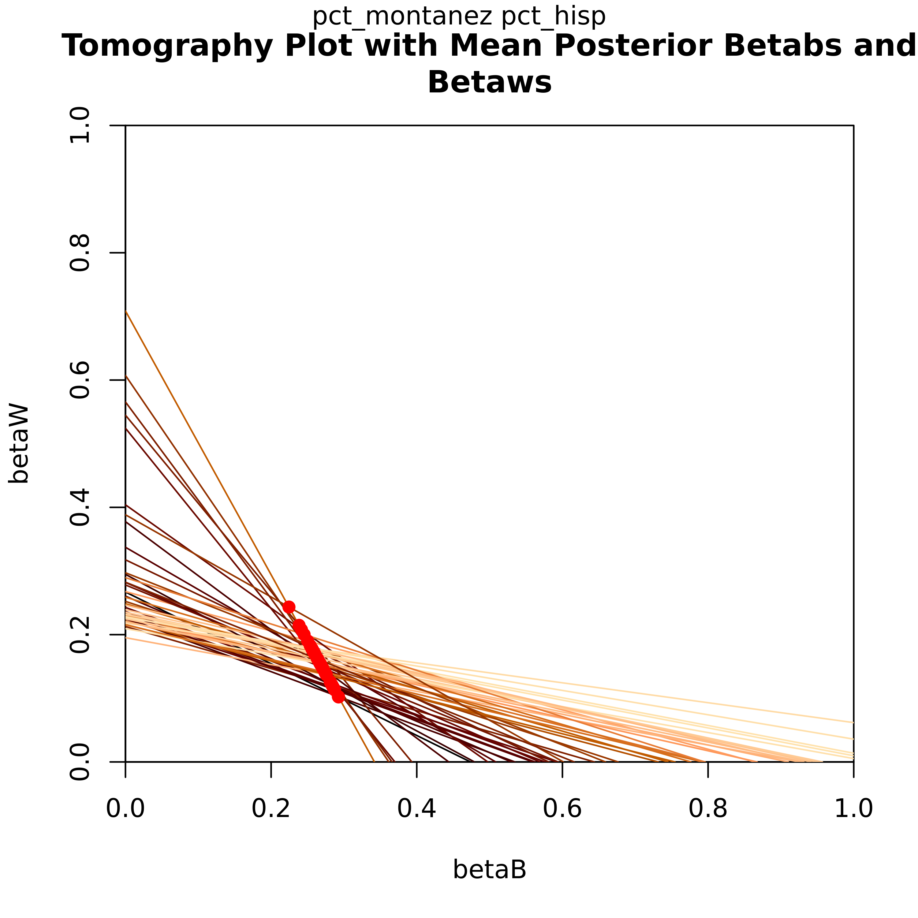
Tomography plots
Each line on the graph represents βb and βw each geographical unit (i.e. precinct). Not only does this plot graphically show the bounds those values have, the overlayed contours show which values on those lines have the highest probability of being an accurate estimate.
-
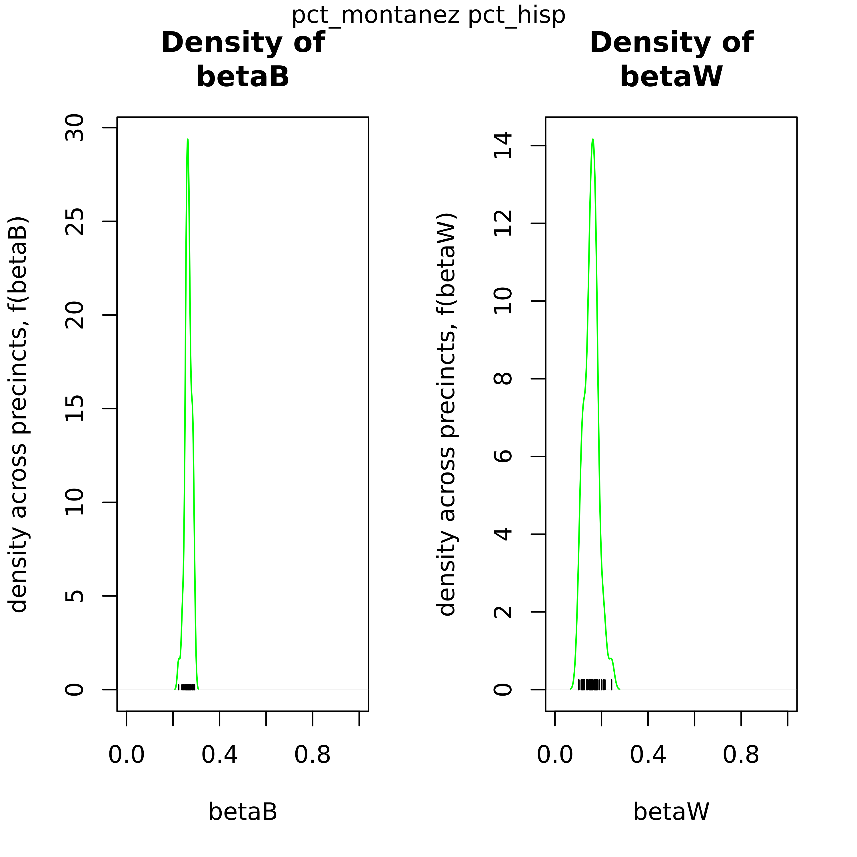
Density βb and βw comparison plots
As an output from iterative ei, these 2-pane plots compare the distribution of βb and βw to show the uncertainty of the point estimates.
-
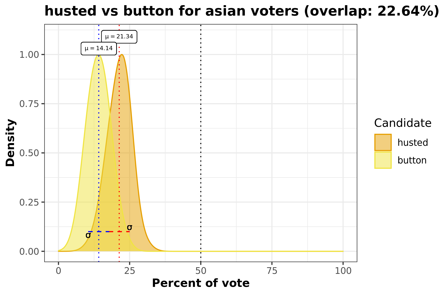
Density voter choice comparison plots for each race
This density plot comparison answers the question “How did Candidate A and Candidate B’s votes for race C compare?”. This visualization includes information such as standard deviation, avergae percentage of race C voters, and overlap percentage.
-
MCMC diagnostic plots
Using
coda,ei_rxc()can create diagnostic plot to assess convergence of the Markov Chain Monte Carlo (MCMC) and visualize the parameter fluctuations over iterations and its distribution. It is recommended to do a diagnostic run and assessing these results prior to running the full RxC analysis.
Introducing our example data set: Corona, CA
The data we’ll be using for this example is from 2014 elections in California, specifically looking at voting results and racial demogrphiacs for Corona by precinct.
head(corona)
#>   precinct totvote pct_husted pct_spiegel  pct_ruth pct_button pct_montanez
#> 1    24000    1626 0.11070111   0.2091021 0.1795818  0.1537515    0.1599016
#> 2    24003    1214 0.10790774   0.2257002 0.1746293  0.1548600    0.1746293
#> 3    24005     732 0.11475410   0.2281421 0.1653005  0.1352459    0.1707650
#> 4    24013    1057 0.08987701   0.2346263 0.1702933  0.1182592    0.2043519
#> 5    24014    1270 0.13149606   0.2299213 0.1834646  0.1259843    0.1629921
#> 6    24015     595 0.09411765   0.2621849 0.1579832  0.1478992    0.1663866
#>     pct_fox  pct_hisp  pct_asian pct_white pct_non_lat
#> 1 0.1869619 0.2483393 0.03730199 0.7143587   0.7516607
#> 2 0.1622735 0.3296460 0.02359882 0.6467552   0.6703540
#> 3 0.1857923 0.3604214 0.05944319 0.5801355   0.6395786
#> 4 0.1825922 0.2364439 0.07377049 0.6897856   0.7635561
#> 5 0.1661417 0.2751764 0.05516357 0.6696600   0.7248236
#> 6 0.1714286 0.2959076 0.14165792 0.5624344   0.7040924
We have a row for every precinct, if we check the dimensions of our dataset you will see that this is 46. We also have 12 variables included in this dataset.
print(dim(corona))
#> [1] 46 12
names(corona)
#>  [1] "precinct"     "totvote"      "pct_husted"   "pct_spiegel"  "pct_ruth"
#>  [6] "pct_button"   "pct_montanez" "pct_fox"      "pct_hisp"     "pct_asian"
#> [11] "pct_white"    "pct_non_lat"
The variables are as follows: - precinct: Precinct ID number
-
totvote: Total number of votes cast -
pct_husted: Percent of voting precinct population who voted for Husted -
pct_spiegel: Percent of voting precinct population who voted for Spiegel -
pct_ruth: Percent of voting precinct population who voted for Ruth -
pct_button: Percent of voting precinct population who voted for Button -
pct_montanez: Percent of voting precinct population who voted for Montanez -
pct_fox: Percent of voting precinct population who voted for Fox -
pct_hisp: Percent of voting precinct population who identify as Hispanic -
pct_asian: Percent of voting precinct population who identify as Asian -
pct_white: Percent of voting precinct population who identify as White -
pct_non_lat: Percent of voting precinct population who identify as Non-Latino
Non-Latino encompasses the Asian and White voting population.
corona$pct_hisp + corona$pct_non_lat == 1
#>  [1] TRUE TRUE TRUE TRUE TRUE TRUE TRUE TRUE TRUE TRUE TRUE TRUE TRUE TRUE TRUE
#> [16] TRUE TRUE TRUE TRUE TRUE TRUE TRUE TRUE TRUE TRUE TRUE TRUE TRUE TRUE TRUE
#> [31] TRUE TRUE TRUE TRUE TRUE TRUE TRUE TRUE TRUE TRUE TRUE TRUE TRUE TRUE TRUE
#> [46] TRUE
So for this analysis there are 6 candidates (Husted, Spiegel, Ruth, Button, Montanez, and Fox) and 3 racial groups (Hispanic/Latino, Asian, and White).
ei_iter(): Tomography, Density comparison, Density voter choice
With that, let’s run ei_ter to output the first set of visuals. If you
want to to opt to create plots for ei_iter you’ll need to set plots
to TRUE. In addition, if you’d like to specificy where you would like
to save your plots, you can specify a plots_path. In this example
we’ll just set it to where this vignette lives.
Time to run our iteraative ei!
cand_cols <- c("pct_husted", "pct_spiegel", "pct_ruth", "pct_button", "pct_montanez", "pct_fox")
race_cols <- c("pct_hisp", "pct_asian", "pct_white")
totals_col <- "totvote"

# Run with plots =
ei_results <- ei_iter(corona, cand_cols, race_cols, totals_col,
  plots = TRUE, plot_path = save_path
)
#>   |                                                                              |                                                                      |   0%

#>   |                                                                              |========                                                              |  11%

#>
#> [1] "Creating density plots"
#>   |                                                                              |                                                                      |   0%

#> Loading required package: ggplot2

#> Loading required package: testthat

#>   |                                                                              |=======================                                               |  33%

#>   |                                                                              |===============================================                       |  67%

#>   |                                                                              |======================================================================| 100%
Now that’s completed, we’ll walk through each plot type that is
generated from ei_iter.
Tomography
Let’s look at the tomography plot for the Candidate for the Hispanic demographic. Each line on this graph represents a precinct, showing the posterior values for βb and βw. One of the key features here is that this informs the bounds for these values for each precinct. The red dots indicate their point estimates.
Density βb and βw comparison plots
These plots can be used to confirm this point estimate distributions for βb and βw across precints. The green density curve allows for insight into the location of this point estimate as well as assess the associated uncertainty. Black tick marks at the bottom indicate the locations of each point estimate that was calculated.
Density voter choice comparison plots for each race
This overlaid density plot answers the question “How do voters from a certain racial demographic vote for two candidates across all precincts?” In this particular example we’re looking at the Hispanic population and comparing how they voted for Husted and Button in this election. We can see that there is almost 30% of overlap between the density curves for these two candidates.
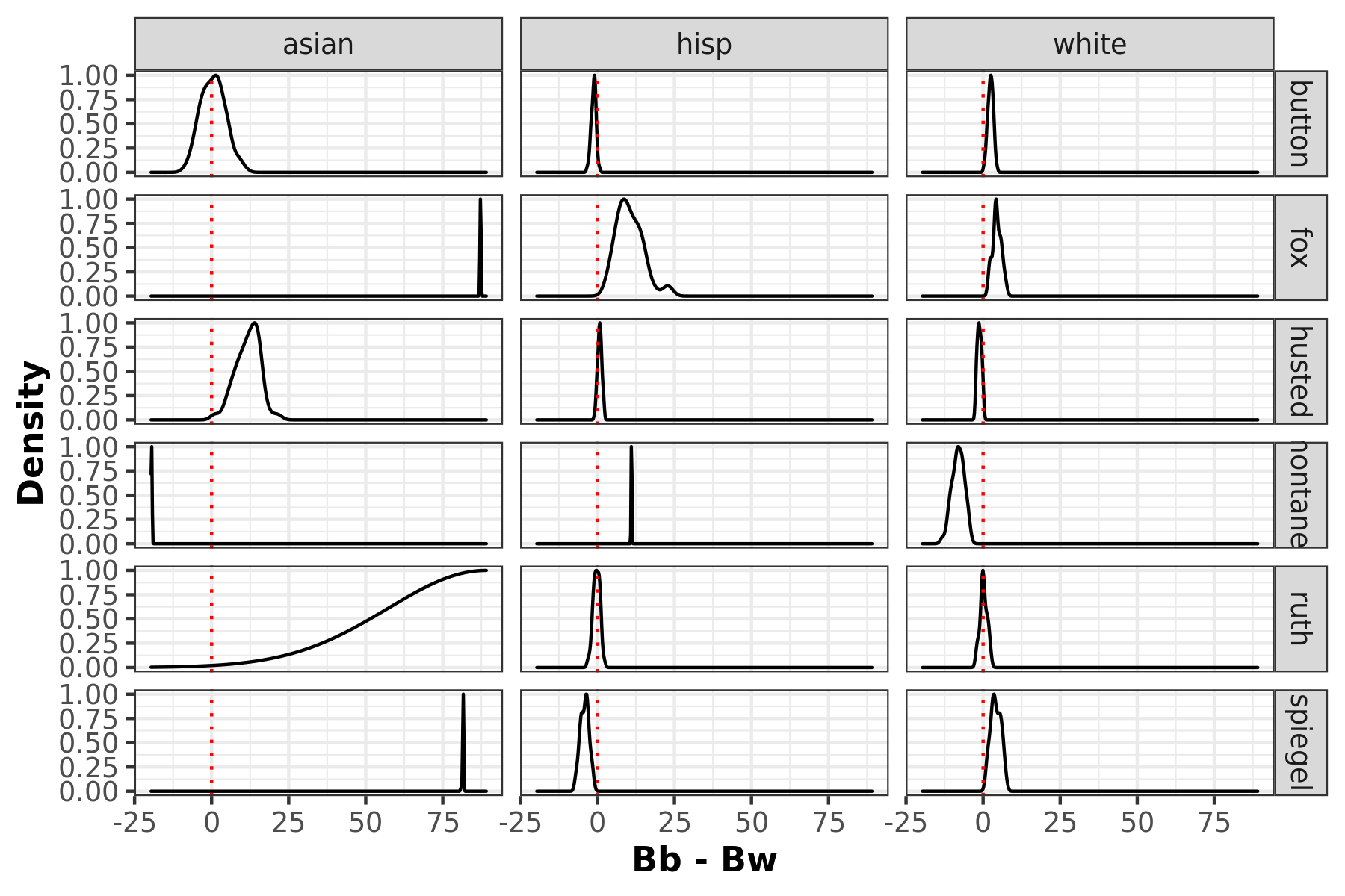
Racial polarized voting density plots
Racially polarized voting by taking the difference of the posterior distribution of the district level aggregates of βb and βw. The furthere the distribtuion mean is away from 0, the higher possibility of RPV.
ei_rxc(): Density voter choice, MCMC convergence
ei_rxc also has capabiltiies to create density voter choice plots. But
keep in mind these may take a long time to run depedning on what you
specify for draws. You can opt into creating these plots as in ei_iter
by toggling plots = TRUE.
In addition, to assess your RxC parameter set up, we recommend running a
diagnostic test first. By toggling to diagnostic = TRUE you will be
able to conduct a MCMC chain analysis and test for convergence.
rxc_diag <- ei_rxc(
  data = corona, cand_cols, race_cols, totals_col, diagnostic = TRUE,
  par_compute = TRUE, verbose = TRUE
)
#> Setting random seed equal to 102657 ...

#> Tuning parameters...

#> Collecting samples...

#> Running diagnostic

#> Running in paralllel

#>   |                                                                              |                                                                      |   0%  |                                                                              |=======================                                               |  33%  |                                                                              |===============================================                       |  67%  |                                                                              |======================================================================| 100%

#> Creating and saving plots
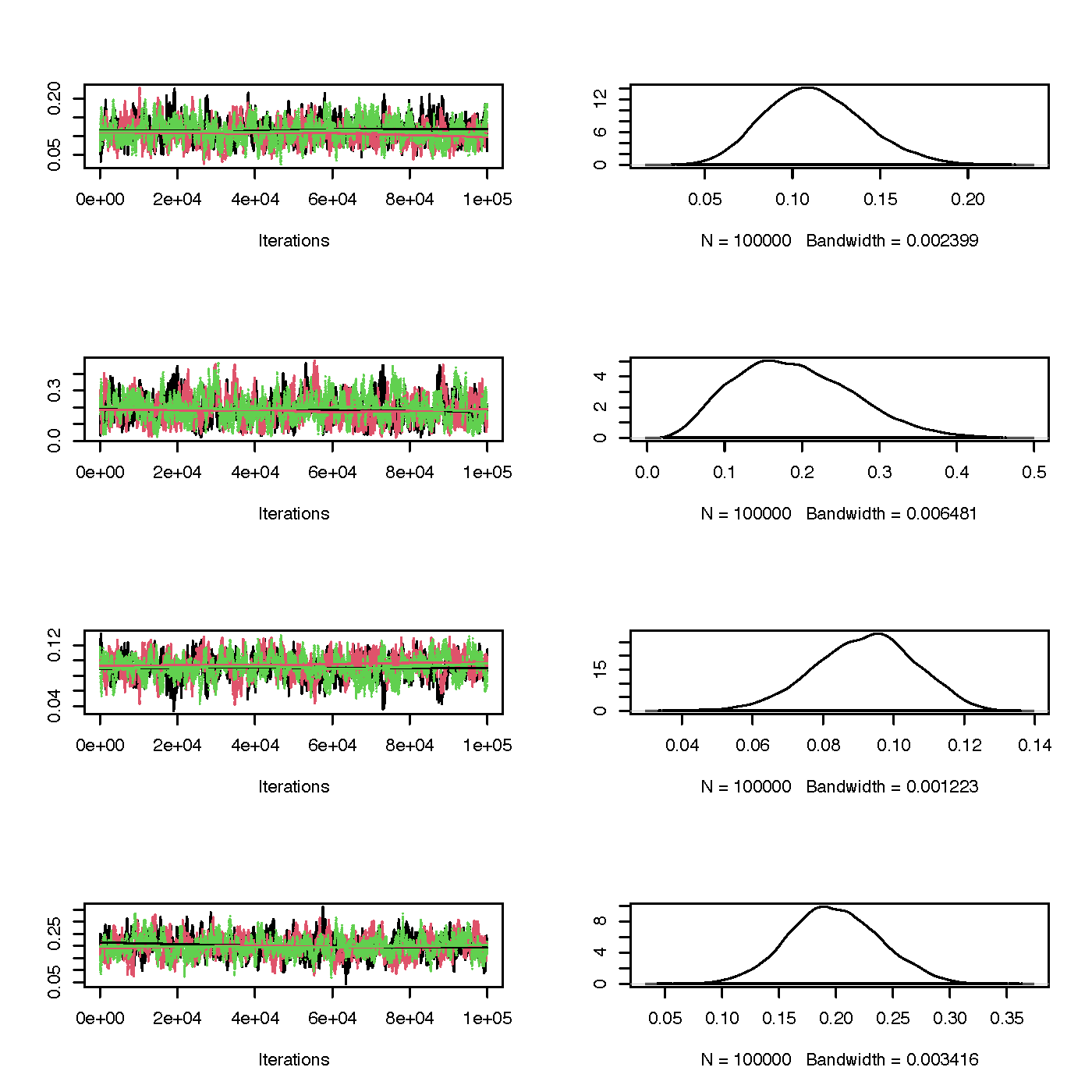
Trace and marginal density plots
The coda package enables creating trace and density plots,
side-by-side for each parameter, with ease. Trace plots show the
calculated parameter for each iteration. If there seems to be a chain
lags to join the rests’ mode, this is an indication you’d want to
increase the burn-in period. On the other hand, the marginal density
plots show the distribution of this parameter. You’re looking for a bell
curve here– if its lumpy you’ll want to run the algorithm longer.
Gelman-Rubin diagnostic plot
The Gelman-Rubin diagnostic is one method to test for convergence to see if the sample is close to the posterior distribution. You’ll get one plot for each parameter and produces the scale reduction factor. In these plots you’ll be looking to for values below a factor of ~1.1 so these plots will give you a good sense of any changes you’ll need for burn-in.

Summary
eiCompare has built in capabilities to create plots for answering
ecological inference questions as well as help improve running RxC ei.
-
If
plotsis specified asTRUEforei_iter(), tomography, density comparison, and density voter choice plots will be created. -
If
plotsis specified asTRUEforei_rxc(), density voter choice plots will be created. -
If
diagnosticis specified asTRUEforei_rxc()trace, marginal density plots, and Gelman-Rubin diagnostic plots will be created. Taking a look at these will help determine optimal parameters.